

A SEASON OF REFLECTION AND TRANSFORMATION
It’s the beginning of a new year and a new era, giving you endless opportunities to promote your interior design services to past, present, and potential clients. Now is the season of transformation. Of reflection. It’s a time when we review the past year and set new goals to pursue in all facets of life.
In 2018 you drew inspiration from “Ultra Violet” to create a majestic space. In 2019 you embraced the young and flirty “Living Coral” to achieve the perfect marriage of masculine and feminine. As you enter 2020, set your sights on a boundless hue that knows no limitations when it comes to design: PANTONE 19-4052 Classic Blue!
CLASSIC BLUE: PANTONE’S 2020 COLOR OF THE YEAR
Every color invokes a different feeling when viewed. In color theory, the color blue:
As a designer, you probably choose blue for one of two reasons:
- You’re decorating a bedroom, playroom, or living space and want a masculine hue to set the tone.
- You’re decorating a living space or commercial space such as an office, lobby, or waiting room, and want a non-aggressive hue to create a calm, quiet atmosphere for your client’s customers.
Leatrice Eiseman, the Executive Director of the Pantone Color Institute, says “We are living in a time that requires trust and faith. It is this kind of constancy and confidence that is expressed by PANTONE 19-4052 Classic Blue, a solid and dependable blue hue we can always rely on. Imbued with a deep resonance, Classic Blue provides an anchoring foundation. A boundless blue evocative of the vast and evening sky, Classic Blue encourages us to look beyond the obvious to expand our thinking; challenging us to think more deeply, increase our perspective, and open the flow of communication.”
USING CLASSIC BLUE DECOR IN YOUR DESIGN
The beauty of blue is that it goes with almost any color, whether it’s complimentary like orange or yellow or analogous like green or violet. When picking your accents, consider the room itself before settling on a scheme.
Bedroom or Playroom
Pair with a bright, bold shade of white, yellow, or green.
Bedrooms and playrooms should be a soothing place to sleep or relax but it should be full of life and happiness to lift the spirits of its occupants.
Artwork to fit this color scheme:
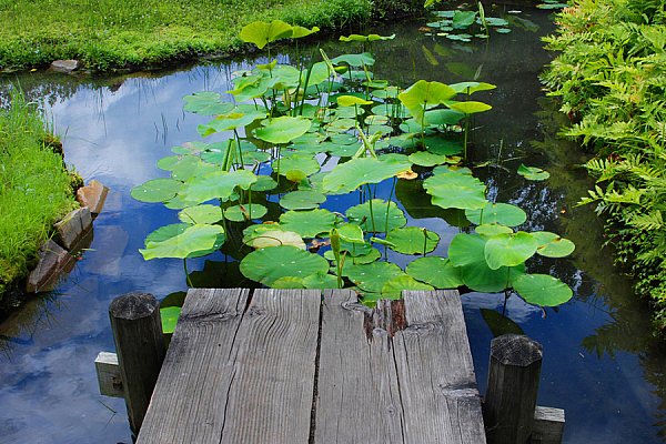
"Stepping off"
At the Lake Collection
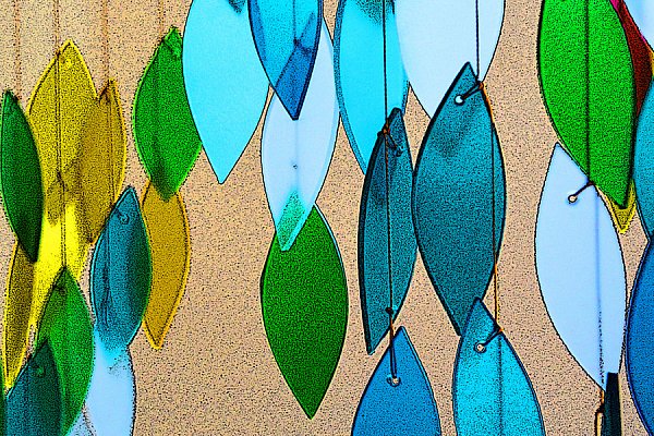
"On A String"
Colorful Collection
Office, Lobby, or Waiting Room
In "Interior Design: Lobby Edition" we discussed the importance of ambiance. These rooms should be clean and relaxing, so opt for warm neutrals like beige or light brown, or darker, muted shades of green or purple for contrast.

"Perfect Fit"
Patterns & Textures Collection
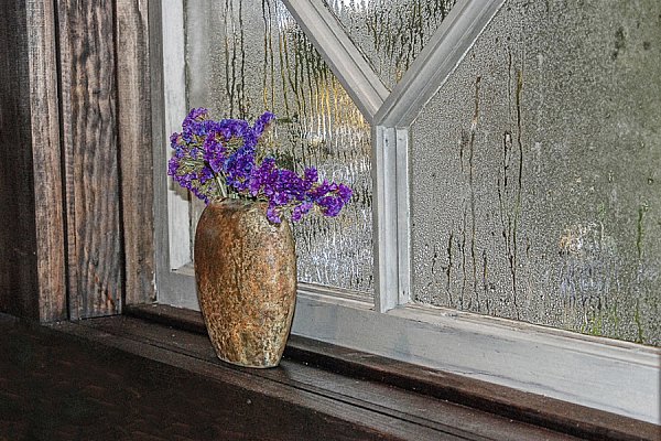
"Quiet Thoughts"
Still Life Collection
Living Room or Den
Put life back into your living spaces with a surprising color to complement this deep hue: orange! Orange is a symbol of energy and vitality, and is a trendy tone that a younger client will love to see in their decor.

"Finger Painting"
Patterns & Textures Collection

"Buoys"
Vintage & Industrial Collection